Who knew that these two crafts would spark the crafty bug across the country? I’ve had these two projects…
Read More
Archives for September 2010
Replace this crappy thing with that crappy thing
There are some things in my home that I want to replace. Shower heads and sink faucets are some of…
Read More
A Tisket, A Tasket
This basket was 75% off, baby! Only problem is, it’s for a plant. I don’t want a basket for a…
Read More
Painting the piano {the idea stage}
On Monday I showed you my new PB inspired mirror above my piano: I mentioned that this piano is getting…
Read More
Hanging Sheetrock is loads of fun!
I’m still recovering from The Great Flood of 2010 here at the Hepworth house. Today I patched the huge gaping…
Read More
An explosion at the Hepworth house
Holy crap! I’m pretty sure a bomb went off in there! Yes, this is was our closet under the stairs….
Read More
Trolling Craigslist
The past few weeks month I’ve been trolling Craigslist like a crazy stalker person. Nothing in particular, just anything that…
Read More
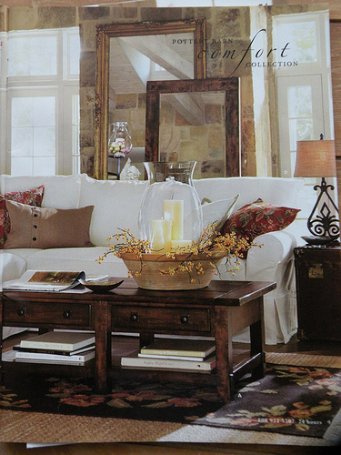
Pottery Barn inspiration
Well, the new Pottery Barn catalog has arrived! As I flipped through the pages wishing I could afford everything, I…
Read More