The guest bathroom finally got a fresh coat of paint! Here’s how it looked when we moved in: And here’s…
Read More
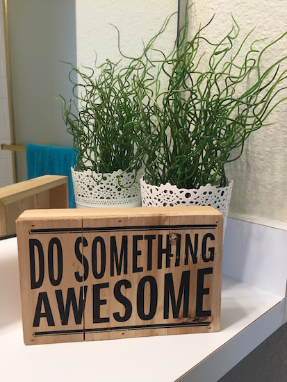
Helping you DIY your home one awesome project at a time
The guest bathroom finally got a fresh coat of paint! Here’s how it looked when we moved in: And here’s…
Read More
I know you have just been on pins and needles waiting to see what color I painted the game room…
Read More
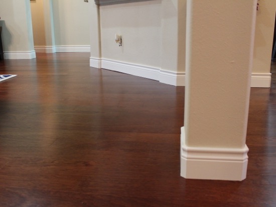
The new baseboards are in and painted. And I am all about that base! Because we did such a large-scale…
Read More
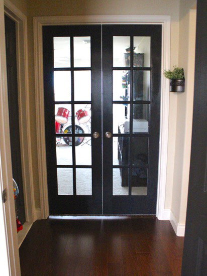
Hey guys! I have missed you. After I posted about all our new doorknobs a few of you noticed I…
Read More
Guess what I’ve been up to lately. If you said, “painting?” then you are absolutely right. Yup, another painting post….
Read More